Recently I was given the very fortunate opportunity to pitch an identity concept for the branding of the Gold Coast City.
With only 4 days up my sleeve, here was my first concept at establishing an identity that was... Simple, Clean, Strong, Bold, Vibrant & Unapologetic.
Introduction
When approaching the task of branding the Gold Coast, I decided the design must respect the city’s past, acknowledge what the Gold Coast is and where it’s come from whilst putting my spin on it.
One of my key objectives was to create a brand with the versatility that was not only functional in terms of use across different sizes and mediums, but through technique could also be classy, professional and sophisticated (which has been lacking from the Gold Coast brand) whilst still being welcoming, playful and fun (which we are ‘famous’ for).
I’m a born and bred Gold Coast local of 38 years and have travelled for 15 of those years working in Sydney and London. I am of the opinion that the abbreviated “GC”, to which we are affectionately referred as, is something that adds brand value to our wonderful city. Exploring a monogram strengthens our brand as it has done for cities such as LA and NYC. You immediately recognise those cities from their initials, so I believe the Gold Coast is lucky in the sense that more and more people refer to our city as ‘the GC’ and we should really embrace it.
This is reflected in my design.


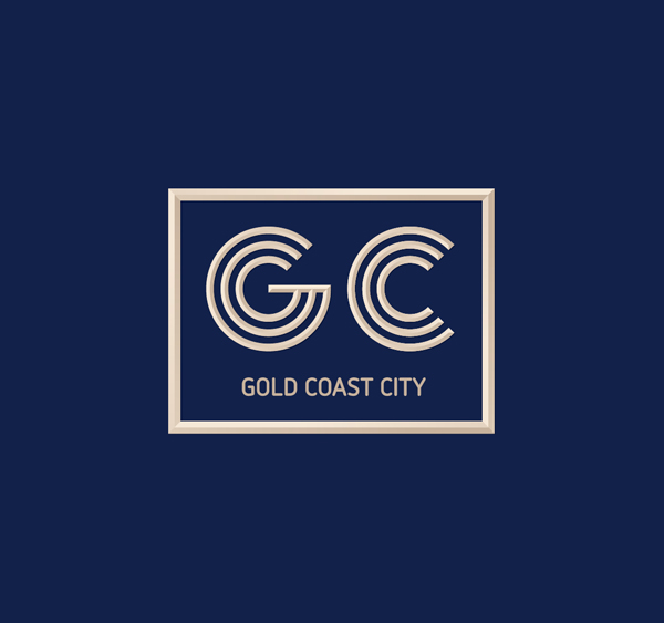
I have created a monogram of G & C to be the mark of the logo that works flexibly with a logotype lock-up.


The G is entirely made up of the 3 initials that make the title of the logo G, C & C (Gold Coast City).


Logo Rationale
GC is the hero of the logo. Its beveled approach gives it a strong and established feel, whilst its simple geometric and single line weight keeps the feel contemporary, especially when used without the bevel effect (as seen below). The flexibility to go between the two is a nice option when applicable to different environments or mediums without losing brand integrity.
The simple & contemporary font used for “GOLD COAST CITY” compliments the mark without competing or fighting for attention, whilst also being clear and easily legible. The use of uppercase letters establishes a sense of security and authority, this is equally balanced by the consistent weight, curved formation and rounded terminals, making the overall appearance feel secure and welcoming.
By framing the logo with the practical expandable rectangle, we establish a binding sense of community and belonging, whilst also feeling exclusive.
Note: I have steered clear of cliché images associated with the gold coast, (sun, beach, waves, skyline) as I believe the Gold Coast is more than just that. Not using these “go to” clichés helps the brand align itself with other areas lacking with the current Gold Coast brand, such as Commerce and Art & Culture. The logo being flexible and generic in nature can be used in conjunction with certain colour palettes, icons and imagery to align itself within certain areas making it completely adaptable and functional. Beaches, suns, waves and skyline fixates us on tourism.

The construction of the logo allows it to be versatile across different shapes (landscape & portrait). Here we have 3 different landscape sizes that give you an example of how the logo can change shape, whilst never losing its fundamental integrity. The same technique can be applied to portrait versions as seen further into the presentation.

With these reversed options you can visualise how the logo could be used as gold coloured plaques.

Logo Mechanics
This image shows you the mathematical ruling behind creating a balanced geometrical logo. These rulings aid the eye to digest the elements with more ease.
This image shows you the mathematical ruling behind creating a balanced geometrical logo. These rulings aid the eye to digest the elements with more ease.


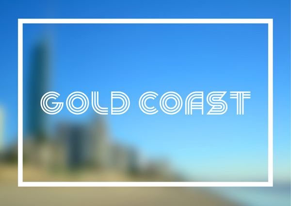
Custom Corporate Font
To further strengthen the GC brand, I have created a full alphabet of uppercase letters that can be used as a font.
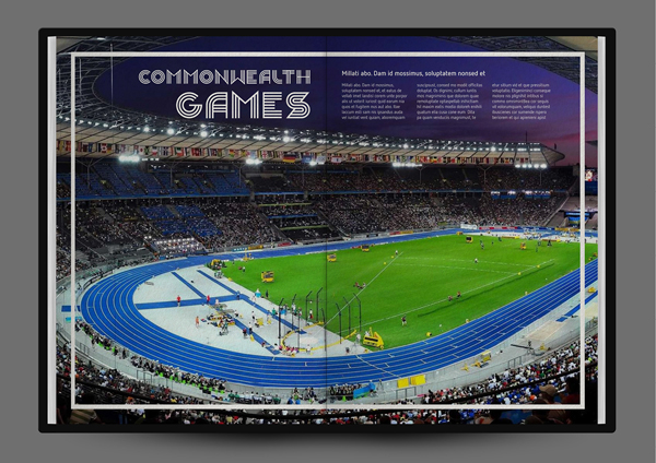
The foundation of the GC font is derived by designing the G first. From there I have used this ruling to form all the letters of the alphabet. By creating a custom font designed specifically for the Gold Coast, we give the brand its own and original personality. The design of the font is also inspired by the upcoming Commonwealth Games and the track lines used in athletics. The flow and movement of the font lends itself to the fun and adventurous outdoors nature that our lifestyle here embellishes. When bevelled, it takes on a new face, looking sophisticated, classy and professional.
The font can be used to further strengthen the brand by using it as titles for feature events, collatoral titles, suburb signs and advertising.
To further strengthen the GC brand, I have created a full alphabet of uppercase letters that can be used as a font.
The foundation of the GC font is derived by designing the G first. From there I have used this ruling to form all the letters of the alphabet. By creating a custom font designed specifically for the Gold Coast, we give the brand its own and original personality. The design of the font is also inspired by the upcoming Commonwealth Games and the track lines used in athletics. The flow and movement of the font lends itself to the fun and adventurous outdoors nature that our lifestyle here embellishes. When bevelled, it takes on a new face, looking sophisticated, classy and professional.
The font can be used to further strengthen the brand by using it as titles for feature events, collatoral titles, suburb signs and advertising.


Corporate Colour Palette
When a mature colour palette is used the brand appears as high class, sophisticated and professional, aligned to the corporate sector, business and the high end, up-market areas of the Gold Coast such as Marina Mirage. Alternatively, when used with the softer tones of the secondary and tertiary colour palettes the brand becomes vibrant, fun and jam packed with personality. This flexibility enables us to adapt to different demographic fields whilst never changing the appearance and integrity of the logo.
My inspiration for the colours have largely been from beach tones like sand and the ocean. With the addition of navy blue we compliment the softer tones as a base colour giving them more authority. For tertiary colours I have been adventurous and included green and pink. This is done to show that we are welcoming, versatile and not one dimensional.


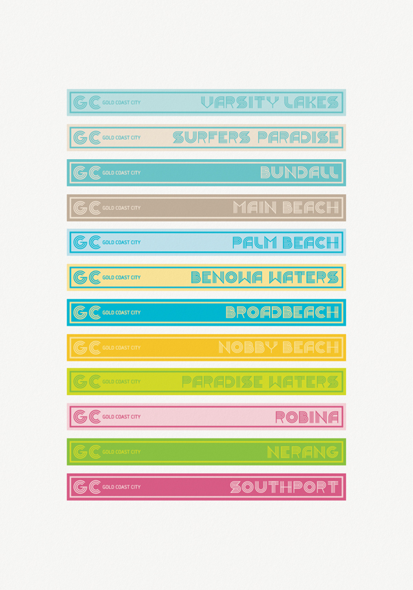

The above image shows the custom font and colours working all together whilst also showing the expandability of the elements that make up the logo. There is the possibility you could use something similar as suburb signs (with the primary colour pallet).

Beach showers. Bevelled metallic gold forms of the logo could be used in and around areas of the Gold Coast such as these showers at Surfers Paradise.


Sub branding
Unification of the subsidiary entities is achieved by using a consistent approach drawing upon the monogram and secondary font of the GCC logo. The format and layout of the elements are rearranged to be more sector specific, with less focus on the GC. The border is unnecessary for these.
Unification of the subsidiary entities is achieved by using a consistent approach drawing upon the monogram and secondary font of the GCC logo. The format and layout of the elements are rearranged to be more sector specific, with less focus on the GC. The border is unnecessary for these.


There is no avoiding the fact the GC has a huge nightlife influence on tourism. These shots show how vibrant the font and logo become when lit up in neon.


Simple, Clean, Strong, Bold, Vibrant, Unapologetic.


